
Designing the perfect cover for your food magazine is critical to making it stand out and increasing its outreach. Despite the proverb “don’t judge a book by its cover,” people wouldn’t pick up your food magazine if its cover doesn’t make them salivate.
Do you have a favorite magazine? Ever wondered why you always get reminded of its cover page whenever someone brings up that magazine’s name or vice versa? That’s precisely the power of having a stunning magazine cover that gets embedded in the readers’ memories. In this blog, you’ll learn some design tips on how to create a magazine cover from scratch and make it stand out.
Understand the elements that make up a magazine cover
The first thing you need to do is figure out what are the components of a stunning cover magazine. Have a look at some of the other popular food magazines like Food Network Magazine, Bon Appetit, and Saveur. This will give you a basic idea of what you should be aiming for.
Every food magazine cover has 4 main components — the title, main image, supporting cover lines, and lead article or recipe. Each component complements the other to bring together a cohesive whole called a magazine cover. We understand that making a cover from scratch can be tedious. That’s why you can use an online graphic design tool like PosterMyWall, which has dozens of food magazine cover templates you can use to craft your cover in a few clicks.
Also Read : Reputable Lawyers in Dubai in Dubai from Reputable Law Firms in Dubai
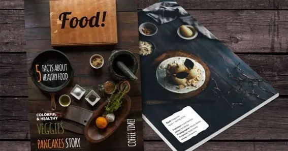
Choose the main image wisely
The main image is the first thing that meets the eyes of your readers. Therefore, it’s perhaps the most important part of your food magazine’s cover page. Since it’s a food magazine, your main image should be of a scrumptious dish or cuisine of dishes. The photography skills count here a lot, so make sure you have a professional photographer on your team.
Alternatively, you could use copyright-free images from the internet but I wouldn’t recommend that because it would be unoriginal. Whichever image you choose, make sure it makes your readers salivate at first glance — and I don’t mean metaphorically.
Also Read : 3 Tips for Ensuring Your Dog’s Health at All Ages
Consistency is key
One of the most challenging parts of creating a food magazine cover is keeping things consistent. What does that mean exactly? It means that if you choose sky blue as your main color theme, all other elements (text boxes, image borders, font color) should be from the family of blue. If not, it should at least not be too contrasting to blue.
Similarly, be cautious of line spacing in your cover — it should stay consistent throughout. Otherwise, your text would look scattered. Always remember, the bottom line is that your cover should look coherent and well-aligned in all aspects and dimensions. Sometimes, it’s beneficial to ask for advice from others or take a break and come back to it later with a fresh pair of eyes.
Fonts make your cover stand out
You could use a variety of fonts on your food magazine cover but again, stay consistent. That doesn’t mean you should have the same font everywhere, but whatever variation you’re bringing in should complement the font of the main title. As for the question of which font you should choose, it depends on the kind of vibe you want your magazine to exude.
For example, if your food magazine is targeted toward western audiences looking for recipes for rich and creamy foods, you’d want to use a font that reflects luxury and elegance but is also minimalistic. Similarly, if you’re targeting vegan audiences, you could go for more rugged fonts like these.
If you want to be creative, you could even try to use 3D text behind and in front of the main image. 3D texts are great at catching the reader’s attention. The bottom line is that choosing a font is subjective, but you’ll surely know which fonts look good and which ones you should avoid.
Click here – Reputable Lawyers in Dubai in Dubai from Reputable Law Firms in Dubai
Don’t forget the background
Most designers don’t pay enough attention to the cover’s background. The background is the canvas that contains the standout features of your cover, so you’d naturally assume you don’t have to pay particular attention to the background — but that’s a bad idea. The subtle effect of a good background can make all the difference between a reader picking up your food magazine or walking past it.
Your background color should complement the font colors on the cover. Plus, it shouldn’t be a constant color gradient throughout the page. For example, if you’re going with light blue, the gradient should consistently change across the cover to indigo, grey, or any other matching color. Just make sure you avoid busy backgrounds at all costs.
Use a thicker paper for the cover
When you pick up a magazine and its cover page is the same quality paper as the rest of the pages, it just doesn’t feel right, does it? A thicker and more high-quality polished paper is crucial to have for your food magazine cover. Make sure you choose a paper with a polished and shiny texture as that’s what’s typically used for magazine covers.
Alternatively, you could go for a unique textured paper such as one that has a matte finish but the rest of the papers are polished and thin. Whatever you do, make the cover page look and feel different than the rest of the pages.
Some final words
The above-mentioned design tips work like a charm for most food magazines, but you must remember that every food magazine is different. Each one has its unique features and flavors, so there’s no universal formula that applies to every magazine, especially when designing is such a subjective field.
Having said that, you should be considerate about a few things. First, the cover should be exclusively tailored to your target audience. Second, it must be well-aligned and give off a consistent overall look. And lastly, it should match the contents of the magazine and not be misleading.
Click here – 3 Tips for Ensuring Your Dog’s Health at All Ages